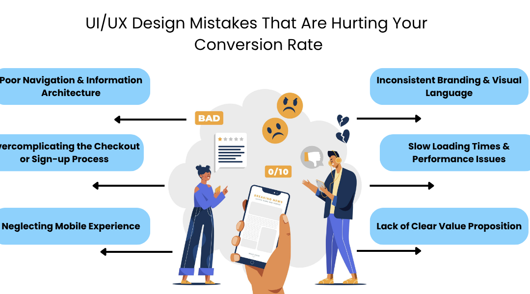
UI/UX Design Mistakes That Are Hurting Your Conversion Rate
Let’s be honest, most businesses pour energy and money into marketing, expecting instant conversions. But here’s the truth: no matter how persuasive your campaign is, poor design can sabotage everything.
Your website or app isn’t just a digital brochure; it’s your first handshake with a potential customer. If the design fails to guide, engage, or build trust, you lose them often within seconds.
That’s where UI/UX design comes into play. At UX Prosperar, we’ve seen countless brands struggle because of small, overlooked design errors. As the best UIUX design company, we help businesses transform confusing user journeys into conversion-driven experiences.
Our focus on user interface design isn’t just about making things look pretty it’s about functionality, psychology, and seamless interaction. A well-designed interface boosts trust, encourages exploration, and makes decision-making effortless. In short, good design sells.
Let’s explore the biggest UI/UX mistakes that might be quietly killing your conversions and how you can fix them.
14 Big Mistakes Killing Your Conversions
1. Ignoring the Power of First Impressions
Users decide whether to stay or leave your website in less than ten seconds. A cluttered homepage, inconsistent branding, or confusing layout creates friction right away.
We often say, “You can’t convert users who don’t stick around.”
The Mistake
Businesses overload their interfaces with too many visuals, conflicting colours, or vague calls-to-action (CTAs). The result? Overwhelm and mistrust.
The Solution
Focus on clarity. Simplify your design and use whitespace to guide attention. Your CTAs should be clear and action-driven. For example, instead of “Learn More,” use “Start Your Free Trial” or “See How It Works.”
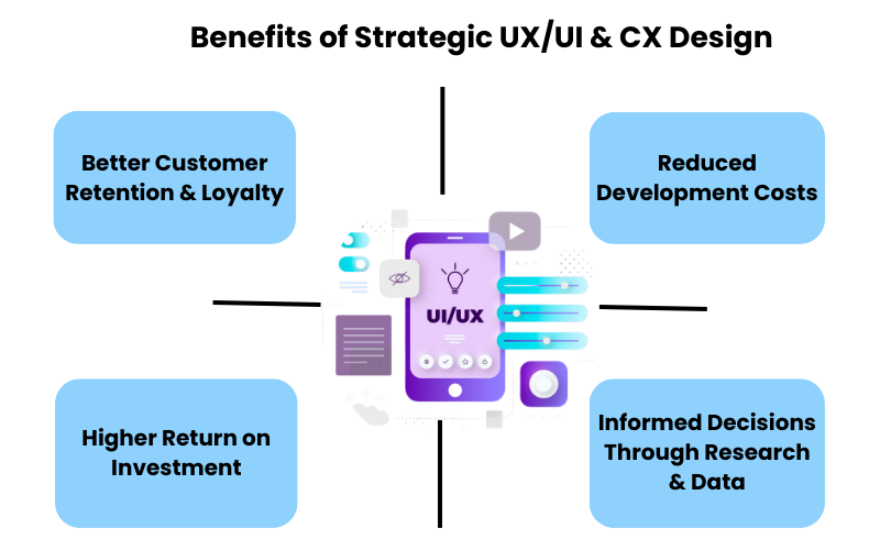
Our benefits of strategic UI UX CX design article explains how thoughtful design can reduce bounce rates and improve customer confidence.
At UX Prosperar, we help you craft interfaces that capture attention instantly and communicate your brand’s purpose within seconds.
2. Poor Navigation and Information Architecture
Imagine walking into a store where the aisles are unlabelled and products are randomly placed. You’d leave frustrated, right? That’s how users feel on a poorly structured website.
The Mistake
Many sites make navigation an afterthought. Menus are overloaded, categories are unclear, and the user journey feels like a maze.
The Solution
Your navigation should feel intuitive, almost invisible. We recommend using user testing and empathy maps to understand how your audience thinks. If you haven’t explored empathy mapping yet, our Empathy Maps Guide is a great place to start.
At UX Prosperar, we conduct detailed usability research to ensure your site flows naturally. Every click should move the user closer to conversion, not confusion.
3. Overcomplicating the Checkout or Sign-up Process
You’ve attracted a potential customer, and they’re ready to buy. But then, your checkout process feels like filling out a tax form.
The Mistake
Too many input fields, unclear progress indicators, or mandatory account creation can drive users away, especially on mobile.
The Solution
Streamline it. Offer guest checkouts, auto-fill features, and clear step indicators. Show trust badges and security signals to reassure customers.
Remember: every extra click increases the chance of abandonment. We design checkouts that feel effortless, reducing drop-offs and boosting conversions.
4. Neglecting Mobile Experience
Over 60% of users access websites via mobile devices. Yet, many businesses still design for desktop first.
The Mistake
Tiny buttons, unreadable text, and slow loading times make mobile experiences frustrating.
The Solution
Adopt a mobile-first design strategy. Ensure responsive layouts, larger touch zones, and fast-loading pages. A seamless mobile experience not only improves usability but also impacts SEO and trust.
We at UX Prosperar prioritise accessibility and device adaptability in every user interface design project we undertake. Because conversions don’t just happen on desktops anymore, they happen wherever your users are.
5. Forgetting About User Personas and Segmentation
Designing without understanding your audience is like talking to a crowd with a blindfold on.
The Mistake
Businesses often assume they know their users without research. This leads to generic experiences that fail to connect emotionally.
The Solution
Define your user segments and create personas that reflect real needs and behaviours. This helps you design with empathy and relevance.
If you’re unsure where to start, explore our guide on What Are User Segments and How to Create Personas.
At UX Prosperar, we use detailed persona-driven strategies to align design choices with user motivations. Because when your users feel seen, they’re far more likely to convert.
6. Ignoring Emotional Design and Empathy
Design isn’t just logic, it’s emotion. A lack of empathy in your design can make even functional interfaces feel cold or impersonal.
The Mistake
Focusing only on usability while ignoring how users feel during their journey.
The Solution
Use emotional design elements friendly microcopy, intuitive animations, and human-centred visuals. Create moments of delight.
Empathy builds trust, and trust drives conversions. Our research-backed insights, like those in Why Loyal Users Leave: What UX Research Reveals About Retention Blind Spots, show how emotional disconnect leads to churn.
We integrate empathy at every design stage so your users don’t just visit they connect.
7. Inconsistent Branding and Visual Language
A cohesive design builds credibility. A disjointed one creates doubt.
The Mistake
Using different colour palettes, mismatched fonts, and inconsistent tone across platforms. It makes your brand look untrustworthy.
The Solution
Establish a visual identity system, consistent typography, colours, and icons that reflect your brand’s personality.
At UX Prosperar, we align UI elements with brand strategy to ensure every pixel reinforces recognition and reliability. Consistency builds confidence and confidence drives conversions.

8. Slow Loading Times and Performance Issues
A slow website is a conversion killer. Even a one-second delay can reduce conversions by up to 7%.
The Mistake
Heavy visuals, unoptimised code, and unnecessary plugins slow your site down.
The Solution
Optimise everything, from images to scripts. Use lazy loading and efficient caching. Prioritise performance in your UI UX designing process, not as an afterthought.
At UX Prosperar, speed and performance are baked into our design approach because a fast experience feels professional, reliable, and rewarding.
9. Overuse of Pop-Ups and Distracting Elements
Pop-ups can be effective when done right. But overdoing them? That’s a quick way to lose users.
The Mistake
Multiple pop-ups appear too soon or cover content users came to see.
The Solution
Time them strategically. Use exit-intent or scroll-triggered pop-ups with clear value propositions. Make closing them easy.
We design subtle, non-intrusive engagement prompts that invite action without breaking the user’s flow.
10. Ignoring Feedback Loops and User Testing
Even the best design isn’t perfect until it’s tested.
The Mistake
Skipping usability testing or ignoring real user feedback. You end up designing for assumptions, not reality.
The Solution
Test early, test often. Use A/B testing, heatmaps, and usability sessions. Track metrics like conversion rate, time on page, and task success.
At UX Prosperar, we don’t just design and deliver, we monitor and iterate. Every change is data-informed, ensuring your digital experience continues to perform.
11. Lack of Clear Value Proposition
If users don’t understand what you offer within seconds, they’ll bounce.
The Mistake
Hiding your unique value behind jargon, vague headlines, or cluttered visuals.
The Solution
Be clear and concise. Your value proposition should be visible above the fold and reinforced throughout the journey.
We help brands communicate value through structured information hierarchy and compelling microcopy. When users instantly understand why they should choose you, conversion becomes effortless.
12. No Visual Hierarchy or Scannability
Users don’t read websites like books, they scan.
The Mistake
Walls of text and unorganised layouts make it hard for users to find what they need quickly.
The Solution
Use contrast, headings, and whitespace to guide attention. Break content into digestible sections. Visual hierarchy helps users process information faster and act sooner.
Our design frameworks at UX Prosperar ensure your most important messages stand out, leading users to action with ease.
13. Ignoring Accessibility
Accessibility isn’t optional. If your site excludes people with disabilities, you’re not only losing conversions but also damaging your brand reputation.
The Mistake
Poor colour contrast, missing alt text, and inaccessible forms are common oversights.
The Solution
Follow WCAG standards. Make your design usable for everyone, regardless of ability. Accessibility builds inclusivity and trust.
We integrate accessibility from the start, ensuring every user can engage meaningfully with your brand.
14. Relying Too Much on Trends
Trendy doesn’t always mean effective.
The Mistake
Chasing every new design trend, parallax effects, minimalism, and dark mode, without considering usability.
The Solution
Trends should enhance, not overpower. Prioritise timeless design principles that serve your users’ needs.
Our approach combines innovation with strategy, ensuring your design feels current yet conversion-focused.
Why Partnering with Experts in User Interface Design Is the Smartest Choice
Creating high-performing digital experiences takes expertise, research, and empathy. Partnering with professionals who live and breathe user interface design helps you avoid costly mistakes and unlock higher conversions.
At UX Prosperar, we bring a holistic approach, combining data-driven research, creative design, and conversion psychology. We don’t just make designs look beautiful; we make them work beautifully.
Every interface we create is grounded in user research, emotional connection, and measurable impact. Our clients see better engagement, higher retention, and stronger loyalty because great design creates great business outcomes.
Let’s Turn Your Design into a Conversion Engine
Your marketing might get users through the door, but your design decides whether they stay. Small design flaws can have massive effects on your revenue, trust, and brand image.
By fixing the UI/UX design mistakes we’ve covered, you can transform user frustration into satisfaction and clicks into conversions.
At UX Prosperar, we specialise in doing just that. Whether you need a complete redesign, UX audit, or conversion-boosting strategy, our team is here to help.
Let’s design experiences that convert.
Visit UX Prosperar today and discover how our tailored UI/UX solutions can help your business thrive.
Frequently Asked Questions
1. How does UI/UX design affect my website’s conversion rate?
UI/UX design directly impacts how users interact with your site. A clear, intuitive, and visually appealing interface builds trust and guides users towards taking action whether that’s making a purchase, signing up, or booking a service. Poor design, on the other hand, creates friction and frustration, leading to higher bounce rates and lost conversions.
2. What are the most common UI/UX design mistakes businesses make?
Some of the biggest mistakes include cluttered layouts, poor navigation, slow loading times, inconsistent branding, and overly complicated checkouts. Many brands also overlook mobile optimisation and accessibility both of which are crucial for modern users.
3. How can I tell if my website’s UI/UX design needs improvement?
If your bounce rate is high or conversions are dropping despite steady traffic, your design could be the issue. Conduct usability tests, review heatmaps, and gather user feedback. If visitors seem confused, frustrated, or disengaged, it’s time for a UI/UX audit.
4. Why should I hire a professional UI/UX design company like UX Prosperar?
Partnering with experts like UX Prosperar ensures your design is backed by research, strategy, and experience. We combine data, psychology, and creativity to create user journeys that feel seamless and drive real business results. Our goal is to make every click count.
5. What’s the difference between UI and UX design?
UI (User Interface) design focuses on the look — colours, typography, and layout, while UX (User Experience) design focuses on the feel, the flow, usability, and satisfaction users experience when interacting with your product. Together, they shape how users perceive and engage with your brand.
6. How often should I update or review my website’s UI/UX design?
Ideally, you should review your design every 12–18 months or whenever you notice a drop in engagement or conversions. User behaviour and technology evolve quickly, so regular reviews ensure your digital experience stays relevant and effective.
7. How can UX Prosperar help boost my conversions through design?
At UX Prosperar, we provide tailored UI/UX solutions built around your users’ needs and business goals. From UX research and persona creation to full interface redesigns, our team ensures every interaction builds trust, drives engagement, and increases conversions. Get in touch with us to start your transformation journey.