uxprosperar logo
How to Create and Use Mood Boards to Elevate Your Design Projects

How to Create and Use Mood Boards to Elevate Your Design Projects

Imagine your team sitting around, tossing around abstract ideas like “make it bold, but not loud,” or “minimalist, yet really human.” Everyone nods politely… and then crickets. That’s where the magic of mood boards comes in.

What Is a Mood Board?

Think of a mood board as your creative roadmap before you even touch design software. It’s not a wireframe. It’s not a prototype. It’s more like a visual whisper: colors, fonts, imagery, and little bits of tone that hint at the vibe you want to create.

In simple terms, a UX design mood board is like the first toast when two people meet, or when your team and your product vision meet. It starts the conversation with emotion, not pixels.

If you’ve ever worked on a product where everyone had a different mental picture, you know how much time gets lost in misalignment. This is where UX research plays a role, it helps you understand your audience before you even start mood boarding, so your visual direction is grounded in truth, not guesswork.

Why It Matters

Let’s say you’re Startup “ZenTrack,” building a meditation app for stressed-out professionals. You might describe it as “calm, friendly, grounded.” But people hear different things. One thinks “spa,” another thinks “vanilla.” A mood board brings everyone onto the same cozy page at once.

You don’t waste time tossing around vague adjectives. You look at visuals and say, “Yep, that feels like ZenTrack.”

In UX, it’s the same as mapping a user’s emotional journey, something we often do in a customer journey mapping process. Mood boards give you the look and feel, while journey maps give you the flow. Together, they’re unstoppable.

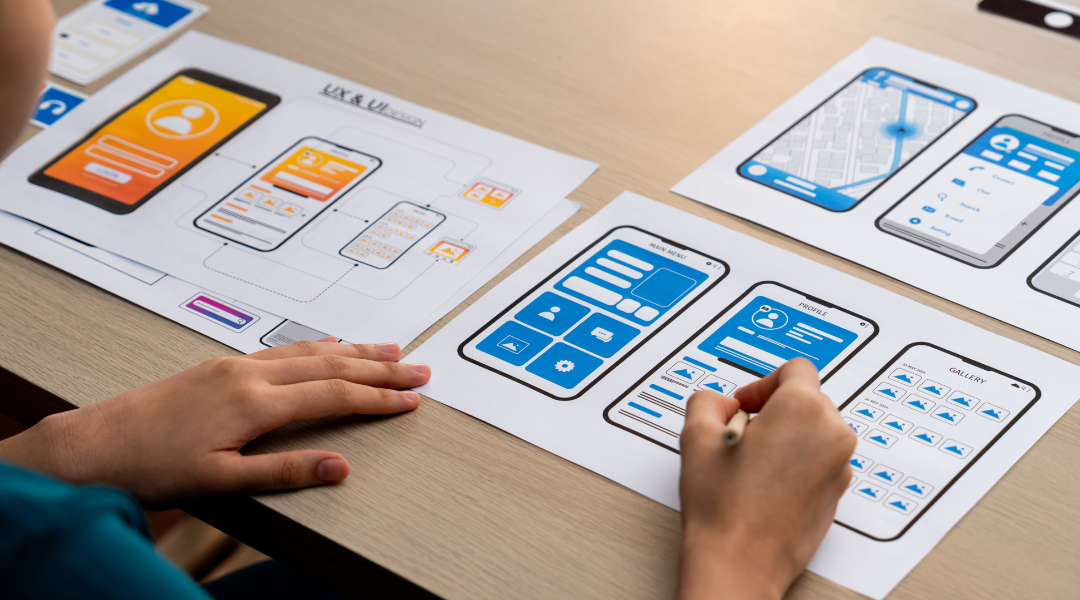
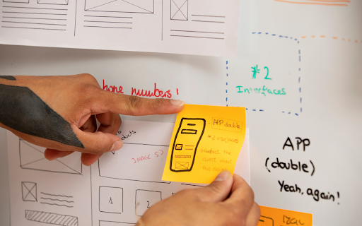
How to Create a Mood Board (Even If You’re Not a Designer)

Here’s a simple, no-fancy-terms process that any team can follow:


1. Start with Your Why

Ask yourselves: Who’s the user? What emotion are we aiming for? What vibe must be avoided?

  • For ZenTrack: “We want users to feel immediately at ease, warm, soft, and approachable, not cold or clinical.”


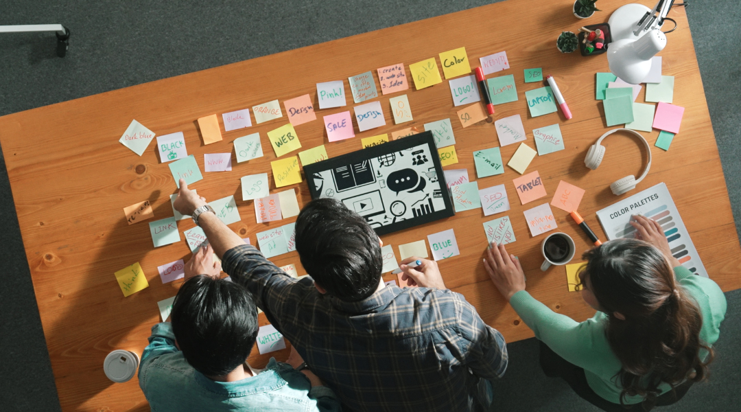
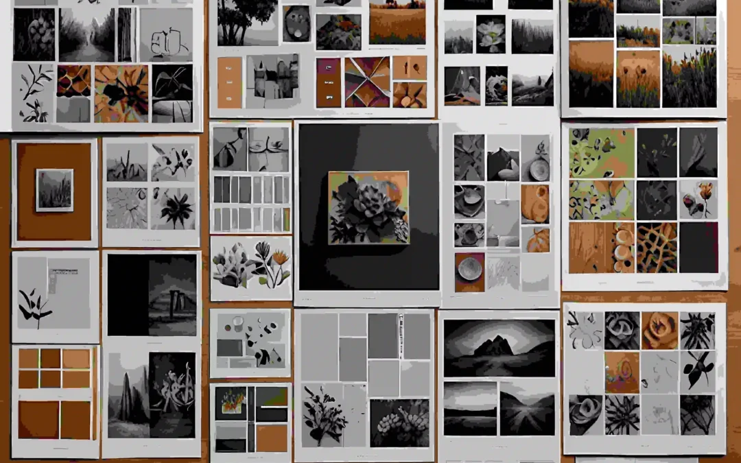
2. Gather Visual Inspiration with Intention

Hunt for colors, typography, icons, images, even sample microcopy. Think of tools like Milanote, Canva, or just drag-and-drop slides. But don’t just collect pretty stuff, be purposeful.

  • Maybe you include softly glowing lights, handwritten letter-style fonts, scenes of serene mornings…


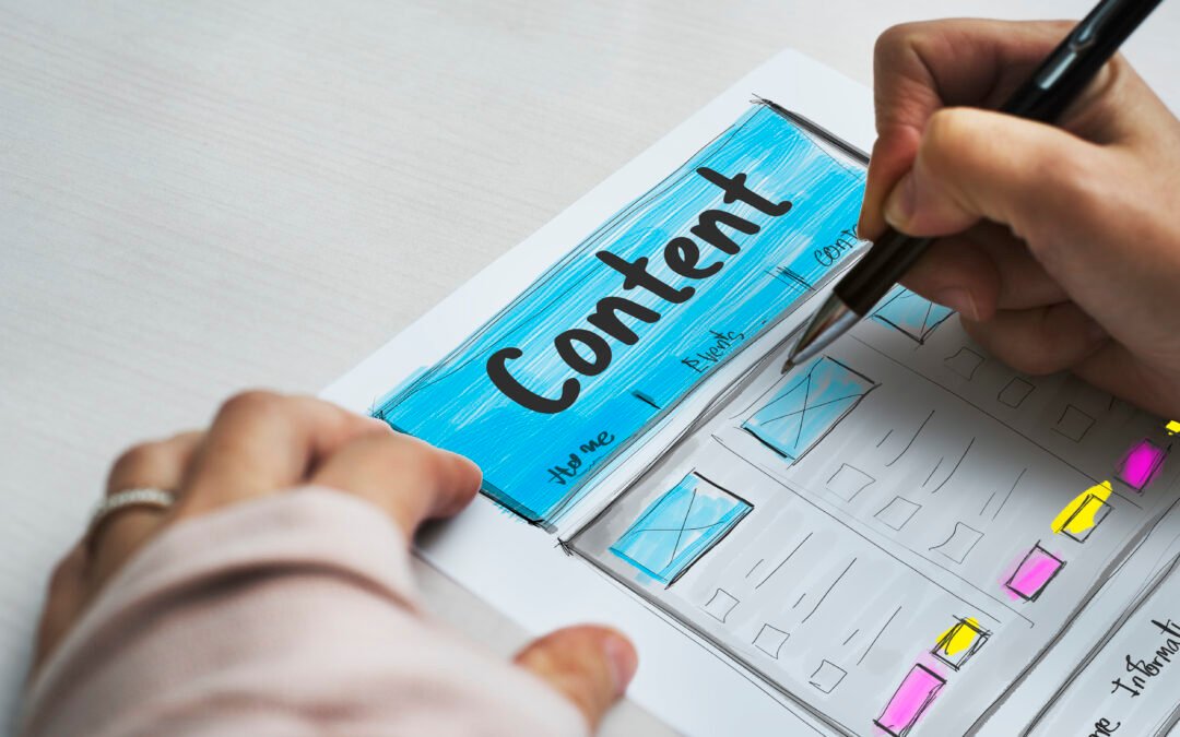
3. Organize by Theme

Group your visuals, color palettes here, font styles there, imagery elsewhere, tone of copy separately. It helps people truly read the mood board, not just glance at it.


4. Add Short Notes (Annotations)

A quick note, “this font feels gentle, human, not techy”; “this image is cozy morning light, not harsh ‘new year resolution’ energy.” These little notes help guide the conversation.


5. Share, Collect Feedback, Adjust

Show it to your team: designers, PMs, marketing, maybe a real user. Ask “What feels right? What feels off-brand?” Tweak until it truly clicks.

Mood Board Examples That Bring It Home

Mood Board Examples

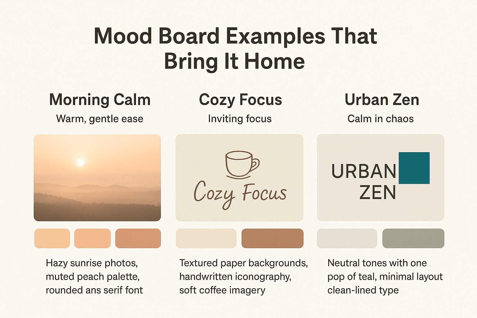
Let’s revisit our imaginary ZenTrack:

Example Mood Key Elements
Morning Calm Warm, gentle ease Hazy sunrise photos, muted peach palette, rounded sans serif font
Cozy Focus Inviting focus Textured paper backgrounds, handwritten iconography, soft coffee imagery
Urban Zen Calm in chaos Neutral tones with one pop of teal, minimal layout, clean-lined type

These aren’t just pretty, they guide everything that comes next: microcopy, UI tone, onboarding screens, even the onboarding flow tempo.

How to Use Your Mood Board in Design


1. Validate Emotion with Real Users

Show it in early UX interviews: “What do you feel when you see this?” It’s early emotional data, a huge win over guessing.


2. Guide UI Design and Wireframes

Designers use the mood board to pick their toolkit, colors, spacing, imagery, vibe, and UI details. For complex apps, pairing this with a UI/UX usability study ensures you’re not just making things look good, but making them easy to use.


3. Align Copy and Tone

If your mood board has soft, kind vibes, your CTAs shouldn’t scream “BUY NOW.” Instead, “Let’s begin” feels just right.


4. Avoid Team Confusion

When marketing says “luxury,” product says “fast,” and dev says “minimal”, the mood board shows the real overlap. Everyone’s designing to feel the same thing.

How ZenTrack Saved Time and Heartache

ZenTrack’s team once spent 3 weeks arguing over the app’s look. Some mocked up bright neon boldness, others pitched icy grays and sleek lines. Nothing matched. But once the mood board came together, warm, soft, handwritten vibes, everything fell into place.

Designers sketched screens that felt cozy, copywriters wrote calming tone-of-voice lines, and marketers even shifted their tagline to “Find your calm edge.” The project moved faster, and the app resonated in testing. Because they aligned early, they avoided weeks of churn.

This process, rooted in research, guided by UX design and research principles, meant fewer redesigns and faster go-to-market.

Mood Boards, Your Pre-Prototyping Superpower

If wireframes are the skeleton, mood boards are the soul. They bring emotional clarity before a single pixel is pushed. For UX design, they’re not optional, they’re strategy.

Ready to Stop Guessing and Start Feeling?

At UX Prosperar, we don’t just make mood boards, we combine them with design sprints, customer journey mapping, and deep UX research to make sure your design feels right and works right.

Let’s build something your users can feel. Reach out to us and we’ll make your brand unforgettable.

Improving App Usability for Multilingual Audiences in Dubai

Improving App Usability for Multilingual Audiences in Dubai

Dubai isn’t your average city. It’s where global cultures, cutting-edge tech, and sky-high user expectations collide… all inside a 6-inch mobile screen.

Whether it’s a ride-hailing app, a fintech product, or a hyperlocal delivery platform, if your app doesn’t work flawlessly in the languages your users speak, you’re out of the game before you even start. In a place as diverse as Dubai, app usability isn’t just a checkbox. It’s your lifeline.

Why Should You Care About App Usability in Dubai?

Because here’s the deal: a sleek-looking app that turns awkward in Arabic, glitches in Tagalog, or feels clunky in Hindi won’t survive long. It gets deleted faster than you can say “update available.”

As a team of UX and CX research experts at UX Prosperar, we know what makes users bounce and what makes them stay. In this blog, we’re not just talking UI tweaks. We’re talking real-world usability that makes your app feel like it belongs in Dubai.

Let’s dive in.

What Even Is App Usability?

App usability is that invisible glue that keeps users engaged. It’s how easy, efficient, and satisfying your app is for someone who’s using it for the first—or fiftieth time.

Good app usability means users don’t need to read a manual, squint at the screen, or rage-quit in frustration. And in Dubai, where people switch between languages and devices as smoothly as they sip karak, your usability needs to work on every level.

Key Aspects of App Usability:

  • Learnability – Can someone figure it out without a how-to video?
  • Efficiency – Are tasks quick and smooth?
  • Error tolerance – Does your app help users avoid mistakes, or punish them for it?
  • Satisfaction – Does using your app feel effortless or exhausting?

Why Dubai Is the Ultimate App Usability Test Zone

Most cities deal with maybe two languages. Dubai? Try 200+ nationalities and 20+ major languages on a regular day.

That means your app has to work in Arabic, Urdu, Hindi, Tagalog, Russian, and sometimes all of them at once.

Here’s what makes Dubai different:

  • Right-to-Left (RTL) Navigation – Arabic literally flips the layout. If your app can’t handle it? Users bounce.
  • Cultural Expectations – Icons, phrases, and color choices carry different meanings. Red might signal urgency in one culture, celebration in another.
  • Multi-Device Usage – Users jump between Android and iOS, tablets and phones, in the same hour.
  • Low Tolerance for Lag – Dubai users expect snappy, stylish, multilingual interfaces. No excuses.

Where Most Apps Struggle (And How to Fix It)

Here’s where we’ve seen things fall apart again and again:

1. Text That Breaks Layouts

English is compact. Arabic or Hindi? Not so much. Longer words break design grids and turn a clean layout into chaos.

Fix it: Build responsive layouts that expand naturally. Ditch lorem ipsum—test with actual translated content.

2. Cultural Missteps

That “?” icon you used for help? It might be confusing—or even offensive—in another culture.

Fix it: Work with local designers or cultural insiders who know the visual language of your users.

3. Cringe Translations

If your app relies on Google Translate, users will spot it and uninstall it.

Fix it: Use native-speaking translators who understand tone, context, and cultural nuance. Additionally, involve moderators who communicate with native users in their preferred language to effectively identify and incorporate colloquial terms.

4. Forms That Don’t Fit

Not everyone has a “First Name / Last Name” structure. Dubai’s global audience means you need to think beyond defaults.

Fix it: Make fields flexible. Support various name and address formats.

5. Ignoring Voice Input

Typing in Arabic or Urdu on a mobile is slow. Many users prefer voice.

Fix it: Integrate voice search and dictation. Google and Apple have great APIs, use them.

Best Practices for Multilingual App Usability in Dubai

  • Prioritize Clear Content Hierarchy

Languages vary in length, but your app’s core journey shouldn’t. Design with hierarchy in mind so that key info is always easy to spot.

  • Design for Flexibility

Your app should work just as smoothly in Arabic RTL layout as it does in English LTR. Use fonts that support multiple scripts and test on real UAE devices—not just the latest iPhones.

  • Test in the Wild, Not Just in the Office

Real usability insight comes from real users. Use remote platforms like UXtweak, or run in-person tests in Karama, Deira, or JLT.

  • Go Beyond Translation

App usability is about more than just language. Localise imagery, workflows, payment methods (hello, cash-on-delivery), and even support options.

  • Embrace Diverse Input

Support voice commands, emojis, and predictive typing that aligns with local keyboards. Think beyond QWERTY.

How to Actually Run App Usability Testing in Dubai

  • Remote Testing

Use tools like Maze and PlaybookUX to gather feedback from a wide range of language users quickly and affordably.

  • In-Person Testing

Sit with users. Watch how they move, tap, pause, or hesitate. These are your goldmine moments.

Who Should You Test With?

Not just English-speaking tech folks.

Try:

  • WhatsApp & Facebook language groups
  • University students
  • Freelancers and delivery drivers
    Incentivise them with vouchers or in-app credits.

What to Measure:

  • Task success rate
  • Error rate
  • Time-on-task
  • Satisfaction scores

The Must-Have Tools in Your Dubai App Usability Stack

Localization

  • Lokalise, Phrase, Smartling

Usability Testing

  • UXtweak, Maze, Lookback, PlaybookUX

Prototyping

  • Figma, Adobe XD, InVision

Make sure your tools support language toggling, RTL layout, and real device previews for the UAE.

Case Study: When Usability Fixed Everything

A Dubai-based ride-hailing app came to us with:

  • A great English interface
  • Broken Arabic layout
  • Google-translated Hindi
  • Forms that didn’t work for Pakistani names or phone numbers

What We Did:

  • Rebuilt layout with proper RTL support
  • Rewrote all translations using native linguists
  • Redesigned form fields to support different formats
  • Ran tests across 5 language groups

Results in 6 Months:

  • Task success rate ↑ : 35%
  • App rating ↑ from 3.2 to 4.4
  • Error rate ↓ by 50%
  • User retention doubled

App Usability = Business Growth

This isn’t just a design tweak. Better app usability means:

  • Higher retention
  • Better reviews
  • Fewer support tickets
  • Lower churn
  • More word-of-mouth buzz

It’s how your app goes from “meh” to “must-have” even in the most diverse digital markets.

Is Your App Really Dubai-Ready?

If your app fumbles Arabic, misinterprets Hindi, or assumes everyone types in English, you’re losing users, often without even knowing it.

But here’s the opportunity:
Get it right, and you’ll unlock next-level loyalty, trust, and growth.

At UX Prosperar, we’ve helped brands fix these gaps and flourish. Whether you’re refining your onboarding, localising your checkout, or redesigning the entire user flow, our team ensures your app feels like home for every user, in every language.

We’ll help you build UX and marketing copy guidelines tailored to each language your users speak. Want to get started with Arabic? Call us to learn how to create culturally resonant Arabic copy guidelines that convert.

Ready to create multilingual experiences that actually work? Connect with us today to unlock expert-led app usability solutions for Dubai’s diverse audiences.

Complete Guide on Customer Experience Journey Mapping

Complete Guide on Customer Experience Journey Mapping

Here’s a quick question: When was the last time you genuinely felt seen by a brand?

Imagine landing on a website and instantly feeling that “wow” factor. Everything from the layout and flow to the tiny nudges feels effortless. You don’t have to ask for help. You’re not confused. You just… vibe with the experience.

That’s the invisible magic of customer experience journey mapping.

At its core, a customer experience journey map is a visual representation of your customer’s entire relationship with your brand. From the first Instagram ad or Twitter post to the moment they become brand advocates, it showcases the whole experience.

But let’s be clear, it’s not just about what they click. It’s about how they feel while doing it. Frustrated, excited, unsure, or relieved? Mapping this out helps you respond with clarity at every touchpoint.

Customer Experience Journey Mapping: Your Brand’s Secret Weapon to Win Hearts

In today’s hyper-digital world, where attention spans are shorter than a Reel, customer experience journey mapping services aren’t a luxury they’re a necessity.

Why Customer Journey Mapping Matters

Let’s be real, customers are spoilt for choice.

They expect everything to work seamlessly: your website, your app, your WhatsApp responses, your emails, and even your Instagram DMs.

One broken moment and… poof, they’re gone.

That’s why customer experience journey mapping is a game-changer.

It helps brands:

  • Understand the actual user journey
  • Identify and resolve friction points early
  • Create those little moments that make customers go, “This brand gets me.”

Whether you’re building a skincare startup or scaling a SaaS platform, journey mapping aligns your team around one shared vision, understanding and delighting your customer.

What Is a Customer Experience Journey Map?

Let’s break it down.

A customer experience journey map (also called a consumer journey map) is not a robotic series of actions like:

Click ad → Visit site → Add to cart.

A real journey map goes deeper. It explores the customer’s needs, frustrations, hesitations, and emotions at every interaction.

Think of it like telling a story, from your customer’s perspective. Not just what happens, but how it feels when it happens. And if you’re a tech brand, even one confusing UI can break the flow. That one misstep can shift the entire experience.

CX Journey Map vs. Traditional Journey Map: The Real Difference

Time for a quick comparison, because they’re not the same.

A traditional journey map is checklist-driven:
Visit → Browse → Buy → Exit.

It captures actions, but not emotions.

On the other hand, a CX journey map (or user journey map) includes:

  • What the customer is thinking and feeling
  • Trust and hesitation during payment
  • Anxiety while waiting for delivery
  • Frustration when seeking support

Traditional journey maps = business-focused


CX journey maps = customer-focused

And in today’s experience-driven economy, that emotional layer is what makes the difference.

The Core Goals of Customer Experience Journey Mapping

Here’s what we aim for when using customer experience journey mapping services:

  1. Empathy
    Understand what drives and frustrates users—not just what they’re doing, but why they’re doing it.
  2. Optimization
    Remove unnecessary steps, reduce friction, and streamline the process.
  3. Personalization
    Deliver content and experiences tailored to different user personas, not a one-size-fits-all approach.

Done right, customer journey mapping removes the guesswork and replaces it with insight.

Key Elements of a Customer Experience Journey Map

Creating a strong journey map starts with the right ingredients:

  1. Customer Personas
    These represent real user types based on data and behavior. They bring specificity to your mapping process.
  2. Stages of the Journey
    Awareness → Consideration → Purchase → Onboarding → Use → Support → Loyalty → Advocacy
  3. Customer Goals & Motivations
    What are users trying to accomplish at each stage? Are they just browsing, or ready to commit?
  4. Pain Points
    Identify what causes friction, clunky navigation, poor support, and unclear messaging.
  5. Touchpoints
    Every interaction matters: your website, mobile app, email, ads, in-store visits, and social DMs.
  6. Emotional States
    Excited? Hesitant? Confused? These states shape how your customer remembers the experience.
  7. Moments of Truth
    Crucial decision points, like delivery expectations or return policies, can make or break trust.
  8. Internal Ownership
    Assign accountability across departments, Marketing, UX, Product, and Support, so nothing gets overlooked.

Real-World Example: Why This Works

Let’s say an online bookstore notices a spike in cart abandonments.

By mapping the customer journey, the team discovers that their checkout page is complicated and lacks trust signals. They redesign it, add live chat for support, and improve messaging around delivery and returns.

Result? Purchase completions increase by 20%.

That’s how CX journey mapping turns into real ROI.

How to Create a Customer Journey Map: Step-by-Step

Ready to map? Here’s how we guide brands through it:

  1. Set Clear Goals
    Start with a specific outcome, improved onboarding, reduced churn, and more signups.
  2. Collect Customer Data
    Don’t assume- use surveys, user interviews, analytics, and session recordings.
  3. Create Personas
    Define clear user types to avoid generalising everyone’s journey.
  4. Map Journey Stages
    Detail each interaction from first touch to loyalty or churn.
  5. Identify Touchpoints
    Include all customer-brand interactions, both online and offline.
  6. Document Thoughts, Feelings, Actions
    What is the user doing, thinking, and feeling at each step?
  7. Highlight Pain Points
    Look for drops, frustrations, or friction zones these are gold.
  8. Validate Your Map
    Test it with users and cross-functional teams to ensure accuracy.
  9. Collaborate Internally
    CX isn’t one department’s job. Everyone should own the experience.
  10. Keep It Updated
    Revisit the map after every major release or marketing campaign.

Use Case: SaaS Product Activation

A SaaS platform notices users sign up but never complete onboarding.

We conduct customer experience journey mapping, which reveals that new users are overwhelmed by feature overload. There’s no clear direction.

The fix? A simplified onboarding flow with tooltips, a “Start Here” guide, and a personal welcome message.

The result? Activation rates double.

That’s the power of mapping the experience, not just building features, but building for real humans.

Journey Mapping vs. Other Experience Mapping Tools

Let’s quickly compare:

Tool Focus Area Best Use Case
Journey Map End-to-end experience Improving checkout flows
Experience Map Overall context of life Mapping holistic life experiences
Service Blueprint Back-end + front-end Restaurant or call center workflows
User Story Map Product features Designing app or SaaS functionality


Each has its place. But for those serious about customer-centric growth, journey mapping is the go-to framework.

Best Tools for Customer Experience Journey Mapping

Here are some tools our team recommends:

  • UXPressia – Built for CX, great persona templates
  • Smaply – Comprehensive and easy to collaborate on
  • Miro – Great for whiteboard-style mapping, especially remotely
  • TheyDo – Ideal for end-to-end journey mapping with strong alignment to business processes
  • Lucidchart – Fantastic for process visuals
  • Figma – Great for custom-designed and interactive maps

Most offer free trials. Find what fits your team’s rhythm.

Advanced Tips for Better Mapping

To take your journey maps to the next level:

  • Track emotions, not just steps
  • Rely on data, not assumptions
  • Bring in cross-functional perspectives
  • Make it actionable
  • Review and refresh the map regularly

How to Present Journey Maps Internally

Now that you’ve built your journey map, here’s how to make it resonate:

  • Tell a story – Show the real customer struggle
  • Visualise it – Diagrams > Data dumps
  • Share widely – Use it in standups, strategy meetings, and planning sessions
  • Tie it to goals – Map insights to business outcomes like churn, NPS, or conversions
  • Keep it visible – It should be a living, evolving artifact, not a static doc

Start Mapping Your Customer Experience Today

Still wondering why customers abandon halfway or never return?

The answer’s probably hidden in the customer experience journey.

The best part? You don’t need expensive software or a huge team to start. Just a clear goal, some honest feedback from users, and a good old-fashioned map.

At UX Prosperar, we help brands uncover blind spots, elevate moments of delight, and connect emotionally with their users through tailored customer experience journey mapping services.

Ready to craft unforgettable customer experiences? Connect with us today to explore our expert customer journey mapping services.

Frequently Asked Questions

How often should we update our customer journey map?

 Every six months, or after major product, service, or marketing changes.

Can small businesses benefit from CX journey mapping?

 Absolutely. In fact, smaller brands often move faster and adapt better to insights.

What’s the most common mistake brands make?

 Mapping from the company’s perspective instead of the customer’s. That’s where most efforts fall flat.

Do we need fancy tools to start?

 Not at all. A pen and paper, Post-it notes, or a Miro board is enough to begin.

5. What’s the biggest mistake teams make with UX research?
Only researching once. UX isn’t a checkbox—it’s a loop.
  • Bad approach: “We did user interviews last year.”
  • Good approach: “We track how pandemic WFH habits changed our app usage monthly.”
  • Example: Duolingo’s owl isn’t annoying by accident—they constantly research what guilt-trips actually work.
How is UX copywriting different from marketing copywriting?

How is UX copywriting different from marketing copywriting?

Spoiler: They both want to win the user, but in very different ways.

Imagine you walk into a beautifully designed app. Everything looks sleek. But then… the button says “Click Here” without context, or the error message just says “Something went wrong.” Frustrating, right?

This is where UI UX copywriting jumps in to save the day.

What is UX Copywriting?

UX copywriting (also called microcopy or UI text) is the art of writing content that guides users within digital products — apps, websites, software — making their journey smoother, clearer, and more delightful. It’s about being helpful in the moment.

Example? Think of messages like:

  • “We’re creating your workspace… just a sec!”
  • “Forgot password? No worries — we’ve got your back.”

It’s short, functional, and human.

How It’s Different from Marketing Copywriting

Feature Marketing Copywriting UX Copywriting
Goal Persuade or convert Guide or inform
Tone Punchy, emotional Clear, supportive
Context Homepages, ads, emails Buttons, tooltips, error messages
Timing Pre- or post-product use During product use
Outcome Clicks, purchases Ease, satisfaction, trust

While marketing copy makes you say “I want this,” UX copy makes you feel, “Ah, this was easy.”

Real-World Scenario:

Let’s say you’re building a food delivery app. Your marketing copy might say:

“Craving solved in minutes. Get your favorite dishes delivered hot & fast!”

But when a user logs in, they face UX copy like:

“Hi Alex, Ready to order? Here’s what’s trending near you.”
Or
“Oops! Couldn’t process payment. Want to try another card?”

See the shift? One sells the experience, the other guides it.

Why UX Copywriting Matters (A Lot)

  • According to a Google UX study, products with empathetic, easy-to-understand UI text see higher engagement and satisfaction.
  • Airbnb redesigned its host sign-up flow using clearer microcopy and saw a 16% increase in completion rate (source).
  • Dropbox’s famously witty error messages improved user delight and decreased support tickets.

Common UX Writing Mistakes (That Good UX Copy Solves)

  • Overcomplicated language (replace “Authentication failure” with “Oops! Your password seems off.”)
  • No error guidance (like “Something went wrong” with no fix)
  • Unclear CTAs (“Submit” vs “Create My Account”)

These small details are huge friction points for users. This is where strategic user experience content writing steps in.

Concerns People Usually Have:

  • “Isn’t UX copy just part of UI design?”
    Nope. UX copywriting works hand-in-hand with UI, but it deserves its own strategy, testing, and tone guides.
  • “Can’t our marketing copywriter handle it?”
    UX writers understand product flows, user psychology, and interface constraints. They test microcopy in real user scenarios it’s a different beast than writing ad slogans.
  • “Why invest in UX copy separately?”
    Because users don’t drop off from a bad ad, they drop off when your interface confuses or frustrates them. Bad microcopy costs conversions silently.

Let’s say you run a SaaS platform. Users are dropping off at the “Set Up Your First Project” stage.

Your button currently says: “Next.”
Your empty state says: “No projects found.”

Now, reimagine with strong UX copywriting:

  • CTA: “Let’s build your first project →”
  • Empty state: “You haven’t started a project yet. Want help getting started?”

That shift alone can reduce churn and build trust.

How UX Prosperar Helps You Nail UX Copy

At UX Prosperar, we go beyond just “writing text.” We:

  • Audit your existing UI content
  • Conduct tone and empathy mapping
  • Collaborate with product + design teams
  • A/B test microcopy to improve conversion & reduce user confusion
  • Build UI UX copywriting systems you can scale with confidence

Whether you’re launching a product or refining an app, UX Prosperar brings user-first writing to the table, with a deep understanding of digital behavior.

The next time you’re tweaking your interface, ask yourself:

“Is this helping or confusing the user?”

If you’re unsure, that’s your signal to bring in UX copy expertise.

Let UX Prosperar help you turn “Huh?” moments into “Aha!” ones.

Explore our UX Copywriting Services

Contact us now!

Relationship Between Design Thinking and UX Research

Relationship Between Design Thinking and UX Research

Imagine this:

You’ve just launched a sleek new fitness app. It’s got all the bells and whistles—modern design, intuitive navigation, and cutting-edge features. But within weeks, user engagement plummets. Reviews highlight confusion, difficulty in navigation, and unmet expectations.

What went wrong?

This scenario underscores the critical interplay between UX research and design thinking. Let’s explore how these two disciplines collaborate to create products that not only look good but also resonate with users.

A Quick Recap on UX Research

We’ve previously delved deep into the nuances of UX research in our guide: What is UX Research & Why It’s Beyond Usability Testing?. In essence, UX research involves understanding user behaviors, needs, and motivations through various methods like interviews, surveys, and usability testing. It’s the foundation upon which user-centric designs are built.

Understanding Design Thinking

Design thinking is a problem-solving approach that prioritizes the user’s needs. It involves five key stages:

  1. Empathize: Understand the user’s experiences and motivations.
  2. Define: Clearly articulate the problem to be solved.
  3. Ideate: Brainstorm a range of creative solutions.
  4. Prototype: Build tangible representations of ideas.
  5. Test: Gather feedback to refine solutions.

At its core, design thinking is about putting the user first, ensuring that solutions are tailored to real needs.

The Synergy Between UX Research and Design Thinking

Consider this: You’re developing a meditation app aimed at beginners.

  • Empathize: Through user experience research, you discover that many novices feel overwhelmed by lengthy sessions.
  • Define: The problem becomes clear—users need quick, accessible meditation options.
  • Ideate: Brainstorm features like 5-minute sessions or guided breathing exercises.
  • Prototype: Develop a basic version of the app incorporating these features.
  • Test: Use usability testing to gather feedback, leading to iterative improvements.

This collaborative process ensures that the final product aligns with user expectations and needs.

Real-World Success Stories

Google

Google employs design sprints—a condensed version of design thinking—to rapidly prototype and test ideas. This approach has been instrumental in developing user-centric products efficiently. For instance, the dating app Happn used a Google Design Sprint to increase user engagement by introducing new features that encouraged interactions between users. 

Airbnb

Facing stagnation, Airbnb’s founders used UX research to identify that low-quality photos were deterring users. By improving visuals and focusing on user needs, they transformed the platform into a hospitality giant. Learn how design thinking transformed Airbnb.

IBM

IBM’s adoption of design thinking led to remarkable results: a 75% increase in efficiencies and over 300% ROI. By centering on user outcomes, they streamlined processes and enhanced product relevance. Explore IBM’s design thinking impact.

How UX Prosperar Can Elevate Your Product

Understanding the synergy between UX research and design thinking is one thing; implementing it effectively is another. That’s where UX Prosperar comes in.

We specialize in:

  • Conducting comprehensive user experience research to uncover genuine user needs.
  • Applying design thinking methodologies to develop solutions that resonate.
  • Integrating UX design and research seamlessly to create intuitive, user-friendly products.

By partnering with us, you ensure that your product is not only functional but also deeply aligned with user expectations.

Ready to Transform Your Product?

Don’t let assumptions dictate your product’s success. Embrace the power of UX research and design thinking to create solutions that truly connect with users.

Reach out to UX Prosperar today, let’s craft experiences that users love.

Why Loyal Users Leave: What UX Research Reveals About Retention Blind Spots

Why Loyal Users Leave: What UX Research Reveals About Retention Blind Spots

When our founder spearheaded UX research for a leading super app in the MENA region, the results were remarkable, achieving a 20x increase in paid subscribers for its loyalty program. This success was driven not by assumptions but by in-depth research, behavioral insights, and a clear grasp of user motivations. Our founder has also led loyalty and subscription initiatives for major digital brands such as Careem, Domino’s, and Tata 1mg. Still, one of the most common challenges even mature digital products face is silent churn. Not from new users. But from those once considered loyal. In this article, we uncover what UX research teaches us about why engaged users leave, how product teams often miss subtle retention signals, and how to design loyalty programs that are genuinely valuable. If you’re working with or looking to partner with a ux research agency in Dubai, these insights are critical to long-term retention.

The Invisible Exit: Why Loyal Users Quietly Quit

The homepage is optimized. The loyalty program is live. Metrics show moderate satisfaction. So why are your most engaged users slipping away, without warning, complaint, or feedback? The answer lies in what users don’t say. That’s where UX research uncovers truths that analytics alone can’t see.

What UX Research Uncovers About Loyalty Decay

Read More about UX Research here.

1. Behavioral Shifts That Go Undetected

People’s lifestyle evolves. A product that once solved a key problem may no longer align with the user’s routine. UX Insight: Behavioral segmentation must be dynamic. What was once a core use case can fade unless monitored and revalidated. Action: Schedule recurring qualitative interviews every quarter to reassess user behavior. Supplement this with cluster analysis of product usage data.

2. Loyalty Programs Misaligned with Perceived Value

A common pitfall is offering benefits that the business assumes are valuable, but users don’t perceive them as such. UX Insight: Run Gabor-Granger pricing surveys or conjoint analysis to test the perceived value of loyalty incentives. This reveals not only a willingness to pay, but willingness to engage. Action: Validate if the reward types resonate emotionally (e.g., exclusivity, access, surprise) or if they feel transactional and forgettable.

3. Design Friction That Reduces Engagement

If accessing loyalty benefits is unintuitive or buried deep in the user journey, friction discourages participation. UX Insight: Reducing the steps between discovering a reward and redeeming it is critical. Many loyalty programs underperform because of poor visibility or unclear UX copy. Action: Run targeted usability tests on reward-related flows—evaluate not just ease of navigation, but also user comprehension and emotional response. You can also incorporate UX copy testing studies to assess the clarity and effectiveness of messaging.

4. Mismatched Messaging Touchpoints

Loyalty messaging must appear at the right moment. If touchpoints are misaligned with user intent, they get ignored or worse, become noise. UX Insight: Users must encounter loyalty messaging at high-friction or high-delight moments, such as cart abandonment, post-purchase, or long session durations. Action: Use journey mapping to identify key moments where loyalty prompts can be most contextually impactful. Test their placement—in-app, via push notifications, or at checkout, and support decisions with A/B tests to determine what drives the highest engagement and conversions

5. Unclear or Inconsistent Program Voice

Even the best program can fall flat if users don’t understand what it offers—or if the brand voice feels generic or disconnected. UX Insight: The tone and personality of the loyalty program should reflect your brand’s ethos and create an emotional link. Action: Develop a copy guidelines framework that outlines tone, vocabulary, messaging tiers, and emotional cues. This builds trust and consistency across channels.

Building a Research-Driven Loyalty Program: Our Proven Process

We’ve used the following approach with clients across industries, including the team that scaled a subscription program to over 20x growth in MENA.

1. Define the Right Benefits

Start by understanding what truly matters to your users. Discounts may be appreciated, but exclusivity, convenience, or recognition might hold deeper value. Use:
  • Conjoint analysis to evaluate combinations of features
  • In-depth interviews to uncover aspiration-driven motivations

2. Communicate the Benefits Effectively

Users must not only receive benefits—they must understand them without effort. Test:
  • Microcopy during onboarding and in-app messages
  • Variants of promotional language for clarity and engagement

3. Establish the Perceived Price

Determine what users feel they’re giving up to access benefits, be it time, data, or money, and ensure the trade feels worthwhile. Use:
  • Gabor-Granger pricing analysis
  • Behavioral economics surveys to assess friction tolerance

4. Identify High-Impact Touchpoints

Mapping loyalty prompts across the customer journey ensures they appear when users are most attentive or emotionally primed. Use:
  • Journey mapping
  • Heuristic walkthroughs of common paths to identify opportunity zones

5. Target the Right Segments

Not all users need the same incentives. Some value recognition, others convenience. Use:
  • Behavioral segmentation via product usage data
  • Persona refinement through qualitative clustering

6. Craft a Clear Value Proposition

Your loyalty program must have a distinct voice and reason for existing. Users should be able to describe it in one sentence. Document:
  • Core value drivers (emotional, functional, social)
  • Feature-benefit mapping tied to user stories

7. Build Scalable Messaging Guidelines

A loyalty program is a product within your product. Its tone should be documented and embedded in your team culture. Develop:
  • Messaging hierarchy across in-app, email, push, and onboarding
  • Tone of voice guides for promotions, alerts, and milestones

Case Study Insight: A High-Churn Loyalty Program Turnaround

A digital services platform faced a decline in loyalty engagement despite positive NPS ( Net Promoter Score). Initial assumptions: The discounts weren’t deep enough. What UX Research found:
  • Benefits were difficult to find within the app
  • Users didn’t understand how rewards were earned
  • The tone of the program felt overly corporate and transactional
What changed:
  • A real-time progress bar was added to the home screen
  • Program rewards were reframed with emotionally engaging copy
  • Segmentation logic was refined to tailor communications based on behavioral clusters
Outcome: A 12% increase in long-term retention and a 26% uptick in benefit redemption within 90 days.

Retention is a Research Problem, Not Just a Marketing One

Most retention strategies rely heavily on CRM and lifecycle automation. But without an evidence-based understanding of why users leave or stay, these systems operate in the dark. Effective loyalty programs require product-led, research-backed execution. If you’re struggling with churn, low reward engagement, or unclear loyalty messaging, it’s time to bring in a partner that goes deeper than surface metrics. Work with a proven ux research agency in Dubai that understands the intersection of behavior, design, and product value.

Ready to Build Loyalty That Lasts?

If you’re serious about retention, it’s time to elevate your strategy with insights that go deeper than dashboards. At UX Prosperar, we specialize in helping growth-focused teams uncover behavioral blind spots, design value-driven loyalty programs, and refine user journeys using advanced UX research. Whether you’re building from scratch or optimizing an underperforming system, our team brings the research rigor and product intuition to make every user interaction count. Let’s turn silent churn into sustainable loyalty. Explore our UX research services at UX Prosperar and book a consultation with our experts