Imagine your team sitting around, tossing around abstract ideas like “make it bold, but not loud,” or “minimalist, yet really human.” Everyone nods politely… and then crickets. That’s where the magic of mood boards comes in.
What Is a Mood Board?
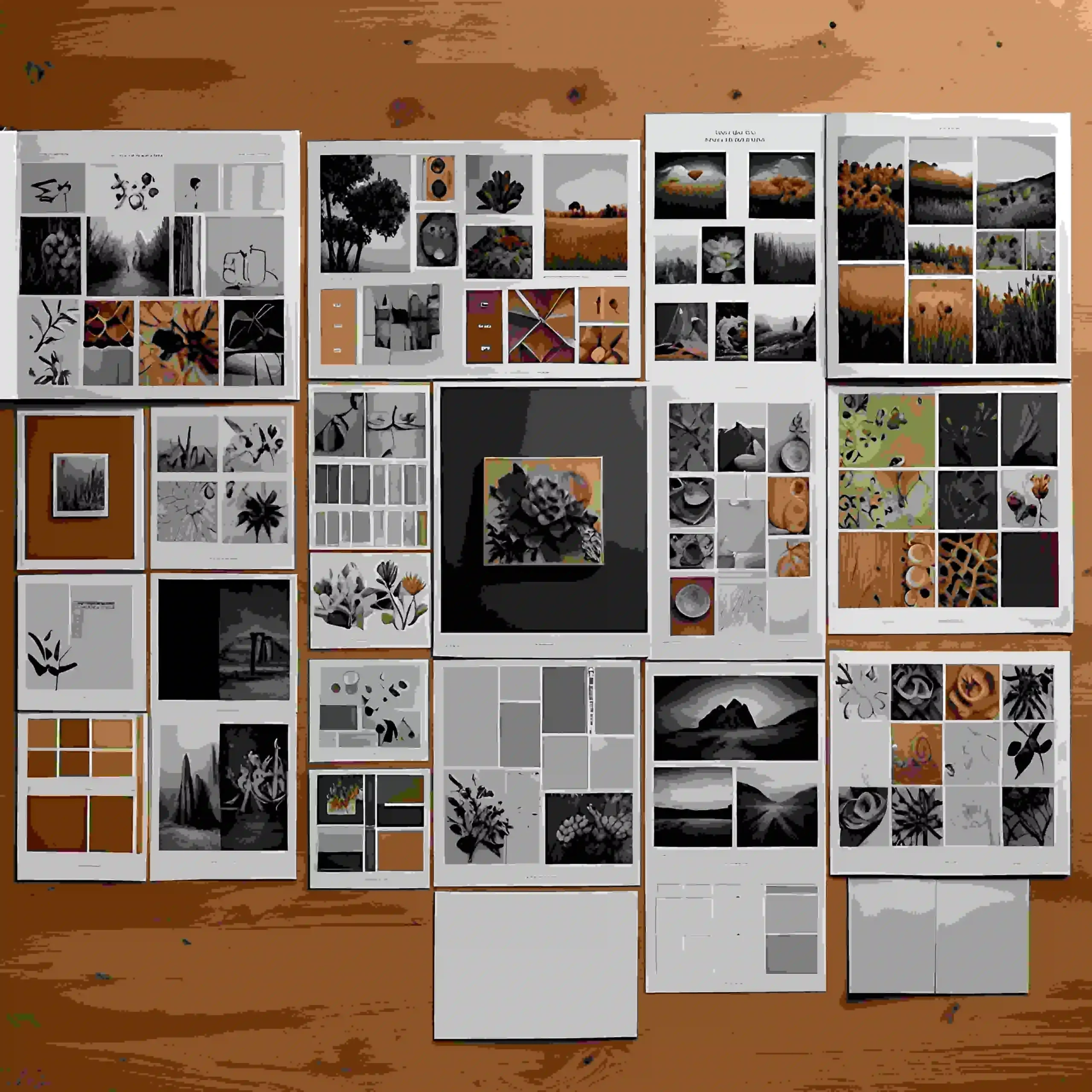
Think of a mood board as your creative roadmap before you even touch design software. It’s not a wireframe. It’s not a prototype. It’s more like a visual whisper: colors, fonts, imagery, and little bits of tone that hint at the vibe you want to create.
In simple terms, a UX design mood board is like the first toast when two people meet, or when your team and your product vision meet. It starts the conversation with emotion, not pixels.
If you’ve ever worked on a product where everyone had a different mental picture, you know how much time gets lost in misalignment. This is where UX research plays a role, it helps you understand your audience before you even start mood boarding, so your visual direction is grounded in truth, not guesswork.
Why It Matters
Let’s say you’re Startup “ZenTrack,” building a meditation app for stressed-out professionals. You might describe it as “calm, friendly, grounded.” But people hear different things. One thinks “spa,” another thinks “vanilla.” A mood board brings everyone onto the same cozy page at once.
You don’t waste time tossing around vague adjectives. You look at visuals and say, “Yep, that feels like ZenTrack.”
In UX, it’s the same as mapping a user’s emotional journey, something we often do in a customer journey mapping process. Mood boards give you the look and feel, while journey maps give you the flow. Together, they’re unstoppable.
How to Create a Mood Board (Even If You’re Not a Designer)
Here’s a simple, no-fancy-terms process that any team can follow:
1. Start with Your Why
Ask yourselves: Who’s the user? What emotion are we aiming for? What vibe must be avoided?
- For ZenTrack: “We want users to feel immediately at ease, warm, soft, and approachable, not cold or clinical.”
2. Gather Visual Inspiration with Intention
Hunt for colors, typography, icons, images, even sample microcopy. Think of tools like Milanote, Canva, or just drag-and-drop slides. But don’t just collect pretty stuff, be purposeful.
- Maybe you include softly glowing lights, handwritten letter-style fonts, scenes of serene mornings…
3. Organize by Theme
Group your visuals, color palettes here, font styles there, imagery elsewhere, tone of copy separately. It helps people truly read the mood board, not just glance at it.
4. Add Short Notes (Annotations)
A quick note, “this font feels gentle, human, not techy”; “this image is cozy morning light, not harsh ‘new year resolution’ energy.” These little notes help guide the conversation.
5. Share, Collect Feedback, Adjust
Show it to your team: designers, PMs, marketing, maybe a real user. Ask “What feels right? What feels off-brand?” Tweak until it truly clicks.
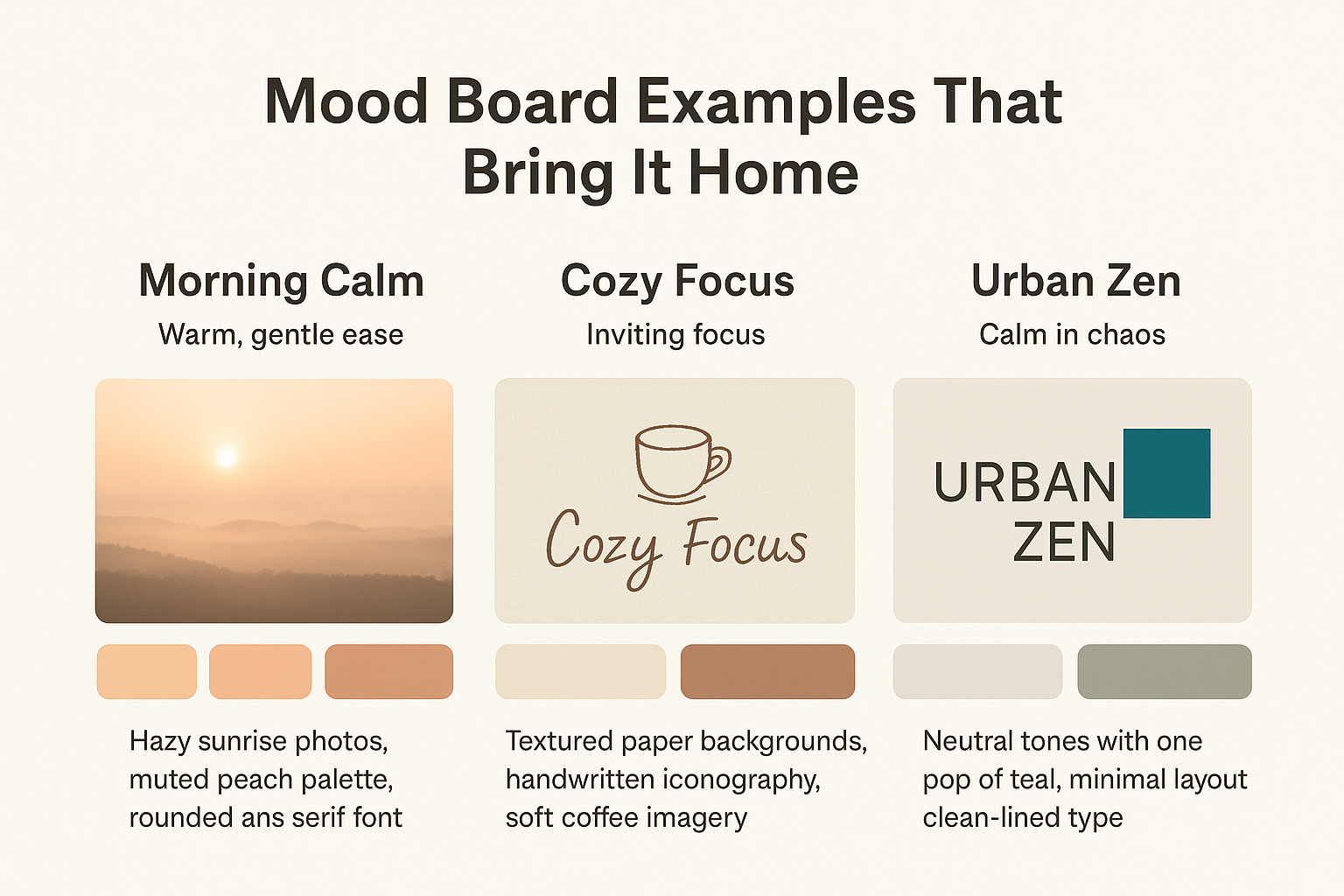
Mood Board Examples That Bring It Home
Let’s revisit our imaginary ZenTrack:
| Example | Mood | Key Elements |
| Morning Calm | Warm, gentle ease | Hazy sunrise photos, muted peach palette, rounded sans serif font |
| Cozy Focus | Inviting focus | Textured paper backgrounds, handwritten iconography, soft coffee imagery |
| Urban Zen | Calm in chaos | Neutral tones with one pop of teal, minimal layout, clean-lined type |
These aren’t just pretty, they guide everything that comes next: microcopy, UI tone, onboarding screens, even the onboarding flow tempo.
How to Use Your Mood Board in Design
1. Validate Emotion with Real Users
Show it in early UX interviews: “What do you feel when you see this?” It’s early emotional data, a huge win over guessing.
2. Guide UI Design and Wireframes
Designers use the mood board to pick their toolkit, colors, spacing, imagery, vibe, and UI details. For complex apps, pairing this with a UI/UX usability study ensures you’re not just making things look good, but making them easy to use.
3. Align Copy and Tone
If your mood board has soft, kind vibes, your CTAs shouldn’t scream “BUY NOW.” Instead, “Let’s begin” feels just right.
4. Avoid Team Confusion
When marketing says “luxury,” product says “fast,” and dev says “minimal”, the mood board shows the real overlap. Everyone’s designing to feel the same thing.
How ZenTrack Saved Time and Heartache
ZenTrack’s team once spent 3 weeks arguing over the app’s look. Some mocked up bright neon boldness, others pitched icy grays and sleek lines. Nothing matched. But once the mood board came together, warm, soft, handwritten vibes, everything fell into place.
Designers sketched screens that felt cozy, copywriters wrote calming tone-of-voice lines, and marketers even shifted their tagline to “Find your calm edge.” The project moved faster, and the app resonated in testing. Because they aligned early, they avoided weeks of churn.
This process, rooted in research, guided by UX design and research principles, meant fewer redesigns and faster go-to-market.
Mood Boards, Your Pre-Prototyping Superpower
If wireframes are the skeleton, mood boards are the soul. They bring emotional clarity before a single pixel is pushed. For UX design, they’re not optional, they’re strategy.
Ready to Stop Guessing and Start Feeling?
At UX Prosperar, we don’t just make mood boards, we combine them with design sprints, customer journey mapping, and deep UX research to make sure your design feels right and works right.
Let’s build something your users can feel. Reach out to us and we’ll make your brand unforgettable.


